I fell in love with photography largely because of the beauty of a black-and-white gelatin-silver print. I have now mostly abandoned that darkroom approach in favor of digital printing. However, my darkroom equipment remains, with lots of paper in the freezer. The digital era created a bit of a black and white limbo-land, but some very beautiful solutions are now in hand.
Inevitably, we compare our black and white results to traditional printing methods, whether gelatin-silver or platinum. A digital inkjet-based print is a different animal—one that can chase the look and feel of other mediums and that has its own unique aesthetic potential. The path you go down is of your own choosing; I'm finding it difficult not to pursue many as I try to understand what I want out of a black-and-white print in this digital age.
Black-and-white printing is both necessary and difficult. It is critical to many of us for its sheer beauty and because the language of photography does not always require color. In fact, scenes are often strengthened without color, relying instead on black and white’s inherent increased abstraction.
Digital printers are designed mainly to print color. Many twists and turns in gray balance and tricks to human perception are employed to make the highly capable color printers we now have. But many of those very improvisations have made printing neutral black-and-white prints very challenging. It is also true that most of us would prefer to have only one printer, one that will print our color and black and white equally well. This was very hard to do for a long time.
Various ways have been developed to creatively adapt to black and white challenges: substituting the printer’s color inks with black and grays (even 6 or 7 grays with black), elaborating workarounds to avoid a printer’s default color processing, or adding gray inks to the color set. All worked to some degree.
Black Gray Custom Inksets were a common solution to digital black and white inkjet printing for a long time, but have now been replaced by good options from the printing manufacturers themselves, Epson, HP and Canon. We now have a substantial effort by the printer companies to do great color, long life, plus added gray inks to the 6 color photo sets making for a dramatic versatility and stunning results.
Gray Ink Plus Color
Epson Ultrachrome K3 (on selected Epson printers)
Hewlett-Packard: Verio color, plus extra black and grays (on selected HP printers)
Canon: Lucia inkset of 6 color plus grays
The basic operation for all of these black and white driver controls is to start with what the manufacturer has determined to be neutral black and white printing, then enable us as users to customize the appearance through trying minimize or create color casts. Additional controls are often offered for overall density, and in some drivers shadow and highlight tonality.
As in so many of the these cases, allowing a little time, experimentation, good notes and test sheets are very helpful to the process.
Issues with Black-and-White Printing
Software: How do you preview and control the printing?
Neutrality
-Paper/ink combinations produce image color variations.
-Viewing conditions and color temperature of light influence neutrality of most black/gray ink combinations.
Density
-Comparison to silver usually results in inkjet not quite coming up to a similarly rich black.
Longevity
-How long will these inks last on which papers?
-How are they tested, by whom, according to what standards?
Paper
-Rag papers hearken back to platinum printing and births an altogether new look.
-Glossy looks more like traditional silver prints.
Black inks for matte and glossy paper
-New Inks from Epson and others.
-Photo Black for glossy papers. Matte Black formulated for matte papers, extra need for black density.
Print Drivers/Control
-Black/Gray Ink Printing Software
-RIPs (raster image processors): software to translate your data into the printer’s format.
ImagePrint RIP, Best Color, etc.
Replacement Drivers: QuadTone RIP
ImagePrint ImagePrint is software for printing, featuring wide printer model support and profiles for color and black-and-white prints using color, gray inks, and supporting image tints. It includes an extensive library of downloadable profiles supporting a wide variety of papers and viewing conditions. Very neutral black-and-white prints are possible as well as image tints and split-toning. By supplying direct and beautiful solutions to black and white printing, ImagePrint has made a significant contribution to digital black and white photography.
ImagePrint includes traditional RIP features like scaling, nesting, and crop marks with extensive print correction controls for color, tone, saturation, and resolution are all built-in.
QuadTone RIP
A number of ink-makers and interested third-party developers have offered black-and-white printing solutions as well. The Quadtone RIP appears as another printer and if driven by tone color curves for different printers, papers, inkset for color tone, cool, neutral to warm. They can be mixed in various ways and is extremely versatile but requires experimentation.
For all of the magic this photograph conveys to me, it still pales in comparison to what I saw.
Exit Glacier and Tundra. Kenai Fjords, Alaska. 1995.
from With a New Eye: The Digital National Parks Project.
THE VIEW FROM HERE
by
Stephen Johnson
Our Eyes, Our Hearts, Our Photographs
We photograph because we see something of beauty, irony, human emotion, and countless other specific scenes of wonder and curiosity. Our eyes take in the visuals, our ears and skin various levels of ambiance, and we pull camera to eye and try to hold an impression of the light.
We often want to imbue the photograph with far more than was literally, visually there, and that is not surprising as human aspirations know few limits. We also want the recorded image to capture not just the moment and the electro-optical capabilities we set in the camera, but also we want our memories held. Those memories are assembled from the many moments spent looking around, taking in the scene and stimulating our desire to hold it in some way.
Challenges
There are a number of challenges along the way to this idea of bearing witness to what we see. Many of them are not specific photographic challenges, but tied deeper to all sorts of reasons we want to remember and share. Breaking some of those issues down a bit seemed worth a bit of effort for the essay this month.
For most of us, some level of beauty perceived and beauty rendered is at the core. Sometimes this is also the strange context of the word beauty as in something disturbing held and rendered with high craft and perception.
Whether color nuances or a myriad of other technical issues, and for all its pleasure, photography ties aspiration to product, experience to fixed rendition.
Color Accuracy
One challenge we face as photographers in love with the beauty of the natural world, is the depth and purity of a real world color. Seen color is often very different indeed from the photographic rendering. As unbelievable as the glacial blue I've managed to capture in some of my photographs, it pales in comparison to the real world experience of seeing that ice in reality.
There are many reasons for color misinterpretation, light sources and real-world nuance are some, the capacity of the cameras to hold the real light and color another.
Some color issues relate to the camera design, and its ability to process the color correctly. The silicon sensors in digital cameras are very sensitive to infrared, some IR cutoff filters on cameras are particularly aggressive and can render near IR visible color incorrectly, as in purple flowers being rendered cyanish blue. Other errors can be introduced with the JPG processing assumptions on-board. This needs to be noticed and corrected by editing the jpeg or watched through the RAW interpretation process to make sure the color is interpreted properly.
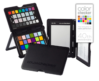
I always carry my Gray Caps, and my ColorChecker Passport so that I can photograph known colors, in the light that I am working in, with the same lens and exposure, to give me a reference point to process the color in the RAW file. This might be a simple white point adjustment by neutralizing the gray to identical RGB values, to making a new custom profile with the ColorChecker Passport software.
A Photoshop CS6 Video Edit of some color misrendering of purple flowers in Golden Gate Park. San Francisco. 2012.
There are other issues less related to photography and more to the totality of the experience, our being there, the smell, the being outdoors, the taste of the air, the exhilaration of being in the world, none of which is directly able to be photographed. It is an ambitious goal, meant for something far more than light capturing devices.
Memory and a Single Light Capture
We also have the element of our memory of the experience accumulating over a period of time, not a slice of a second of a camera's shutter. I call this experience the concatenation of memory. Photographically we end up wanting a single moment's image, based only on light to hold a stream of experience that we lived. Even without overtly thinking of motion or time passing that might suggest video, we assemble a mental image of memory from all of our glances around the scene, exploring the photographic possibilities, and want to hold them.
Memories of a place, even a specific scene, are built-up from dozens of glances. Our eyes refocusing, iris opening and closings, detail being noticed and mentally zoomed in upon, all of which ask the resulting photographs to encode these very diverse and wondrous memories into a single, two dimensional light-based captured moment. It is daunting.
Depth of Focus
For me, this dilemma suggests a number of approaches. One of which is to try to render the scene as much in focus as possible. I've never been a fan of selective focus. No matter what I glance at in the real world, it snaps into focus because that is how our eyes work. We focus on where we are looking. My own values regarding focus are much more closely linked with the heritage of Group f64. So my agenda is to always pay sufficient attention to discovering the ideal focus point and aperture to achieve the depth of field the image needs. As I've discussed elsewhere, this is rarely solved by just stopping down the lens and hoping, but rather through careful calculation and evaluation.
Mixed Light
Shadows and highlights in the same photograph can sometimes look very strange in the rendered file. Your up front experience was able to experience both, remember both, but then you have to deal with overly blue or overly warm renditions of a whole. There are times when the rendered scene demands modifying one or the other to match your dominant memory or what you now judge to look realistic. As neither is completely wrong or right, this is a fascinating dilemma. Sometimes easing off on both extremes of color adjustment to find a middle ground can work. Most often the scene is balanced for the brightest light, and any out of the ordinary overly blue shadows can be de-saturated a bit if their realism becomes a question.
Implication and Hope
In order for photography to be a means of communication, the subject matter must be light, by definition. It is amazing how often we expect an image to convey our feelings, perhaps because we felt something so strongly at the time we made the photograph. And that meaning may always be re-conveyed to us as our memories are triggered. With an audience, it can be much trickier. As the language of the medium is light, and we often hope for word based ideas to come through, we often ask of the medium qualities it is simply not capable of carrying.
There are some images though, so unique in the power of their human appeal of emotion, with very strong visceral reactions, that can generate all sorts of responses. They may not be specific ideas, but deep emotion does seem to be at the heart of our photographic medium's capabilities.
I frequently tell students you can't photograph ideas, but you can capture emotion. Words and meanings like nostalgia are elusive, and that you cannot depend upon your words being in the photograph you make. On the other hand, photography is such a remarkable and challenging medium that you can record things that are not even literally there by most reality standards, like a shadow.
We hope to communicate with our photographs, but that is often through implication and allusion, rather than literal meaning, even while we may hope for far more. That hope can be limiting though, our own intent may contain less than someone else might take from and bring to it, even as the image may contain less literal meaning than we may hope for. It is curious.
One of the attributes of most visual art is the ability to make something visually strong, but simultaneously somewhat ambiguous, giving the viewer a wide range of possible emotional reactions. This can sometimes take our own creations into realms we never imagined. This might be the best of all worlds.
Sierra Club Exhibit-Format Series Photography Books
Browsing a used bookstore in Half Moon Bay, I came across one of the exhibit-format series books David Brower put together for the Sierra Club in the 1960s. This one, the 9th in the series, the 1964 "The Sierra Nevada Gentle Wilderness," was a first edition for $20. I've got too many books, but I bought it after a moment of thought and my friendship with Dave, a few people on the Club's Publishing Committee such as Ansel Adams and Martin Litton. Martin was still flying when I last saw him a couple of years ago, then about 85. He started wooden dory trips down the Colorado River in the 1970s, and I was lucky enough to be invited along on one of the last trips in 1989.
These books were deeply influential on the environmental movement, photography's role in conversation and my own commitment to the natural landscapes of the earth.
Shortly thereafter "In Wildness is the Preservation of the World" appeared featuring the work of Eliot Porter. It was a remarkable call for the preservation of the natural world.
I remember a time in the early 1980s at Friends of the Earth, Dave Brower showed me the original 3-ring binder containing Eliot's book proposal, with prints in sleeves and typed captions. I don't remember clearly how much text was in the binder, but I felt privileged to see and hold what I considered to be a treasure.
My friend Dave Bohn continued on with the 9th. installment of exhibit-format series in 1967 with the book "Glacier Bay: The Land and the Silence." It was a major influence on me years later. In 1979, I was introduced to Dave Brower who offered to help me with my "At Mono Lake" project through which we became friends. Dave Bohn also helped with the book, contributing a commentary, some photographs and some organizational finesse. A world started to open up for me that circled right back to some of the people who opened up my eyes to the power of photography to inspire people to save natural places.
Do you know these books? Which influenced you and how? Let us know.
Photoshop CS6: Better RAW and Video
With the release of the Photoshop CS6 Beta I can now talk about what I believe to be some of the significant new features.
RAW
The increased power and smoothness of the RAW Processor is an important improvement. It is now possible to hold very high dynamic range captures and process them into a very useable form. The Recovery and Fill sliders have been replaced by new Shadow and Black sliders for the dark values being managed and White and Highlight sliders.
Aggressive use of Recovery and Fill in the past could produce an unusable banding between the extreme values held and the rest of the image. These new controls seem to give much more flexibility and not produce the banding, which is a major step forward for the program.
Since this is very close to what I've been asking for for some time, I am very pleased with the progress. Although Eric Chan already no doubt had a good idea where he was going with this part of the RAW Processing engine, it does make me feel great that the result is almost a mirror of what he and I talked about at a party in New York next to a big picture window at sunset overlooking lower Manhattan in 2010. Thanks Eric. And of course, as always a special thanks to Thomas Knoll and Zalman Stern.
The View Out the Window NYC, RAW and Dynamic Range Discussion. iphone photos. 2010.
This doesn't eliminate the need for HDR exposures in some cases, but if the scene can be captured by the camera, it is now much easier to render out extremes of contrast into a smooth and human rendition.
Video
The new video editor in CS6 makes editing and correcting small video projects almost a joy. With the comfort and power of Photoshop's familiar controls, I now feel empowered to do color and tone correction, generate titles and assemble cuts into a photographically based set of decisions. It is a kick to use and opens up many possibilities.
Take our Pt. Reyes Workshop next weekendApril 21-23,or the Pt. Lobos/Carmel Workshop coming up the following weekend, April 28-30, 2012 and you get your choice of a Print of the Month original signed photograph or a Coupon for a One Hour Consulting with Steve free with your enrollment!
Students can choose either this month's Featured Print from Pt. Lobos or One Hour of Consulting (normally $250), in-person or virtual. The consulting might take the form of a color management tutorial customized to your needs and equipment.
Using Adjustment Layers to edit photographs in Photoshop is a wonderfully freeing and powerful way of working in a non-destructive manner. My most common edits involve small contrast changes in a CurvesAdjustment Layer.
In color photographs, increasing the contrast will also likely lead to a perceptible increase in saturation when the Adjustment Layer is set for it's default Normal Blend Mode. This can create an unnatural level of saturation when only a contrast change is being sought. The default Blend Mode, normal is just that, the normal blend mode which edits all three grayscale channels making up the RGB file in a way that also pushes the contrast, even if such a side-effect is not desired.
A simple change in the Blend Mode from Normal to Luminosity will eliminate this saturation change, imposing the curve as though the image was currently in the LAB mode where the grayscale brightness values can be edited separately from the color.
Using Adobe Bridge PhotoDownloader or Lightroom'sImport download feature empowers photographers to take care of critical matters right up front.
Location: choose the location to offload the files.
Create Subfolder: Auto Folder Name Generation create and name custom folders according to what makes sense to you. I use year, month, day.
Rename Files: Custom naming, instead of using the arbitrary photo names coming out of the camera, custom name your photos on download to something that makes sense to you for easily find later. I use the same naming protocol as the folder name, with the added custom text identifying the place.
Convert to DNG: convert your files on download from the proprietary camera format to Adobe's documented DNG (digital negative) format.
Save Copies to: Back up Copy as a basic safety measure, simultaneously back up your files to a second drive as you offload.
Apply Metadata: add your name, copyright and contact information, all on download. Make custom Metadata Templates that contain all of this information always ready to apply to your photographs.
For many years I've been tracking my digital files with a simple little utility called Disk Tracker.
It is just a simple file name and basic info tracker, that indexes disks automatically or manually and lets you search for files at will. There are many file tracking utilities out there, for both the Mac and the PC. I would strongly suggest you use one of them, even if you are using Lightroom or Aperture with their built-in databases.
Finding precious files is of course made much easier by careful file naming to begin with, particularly for photographs. Which is why I always custom name my photographs on download into a sequence that helps me identify and find the images later.
Example
Date as start of file name:
20110405
Custom location name:
ptlobos
Then numbered sequence within the set:
0001
Resulting in a stream like this:
20110405_ptlobos_0001
Long exposures, at night for star trails, or simply because of low light, once meant simply the bulb setting (or T) on the shutter, and some calculations (guesstimations) of reciprocity failure exposure compensation, multiple tries and faith. Absolutely beautiful work could be done, but it took practice and patience–of course, most photography does.
Nowadays things are different, but challenges remain. Silicon builds up noise with long exposures, with heat being one of the problems. In astrophotography this is battled back by cooling circuits on the cameras, or even liquid nitrogen for the big guys.
Many of our cameras now have long exposure noise reduction modes which very cleverly takes a photograph subsequent to your exposure, of the same length, with the shutter closed, thus producing a noise map of the sensor. That so -called dark current image is then subtracted from the image. These features are well worth using.
Additionally, lower resolution dSLR cameras tend to be more sensitive as their pixel wells are larger, therefore have more silicon per pixel to gather photons. I've seen the difference between a 6 megapixel dSLR and a 22 megapixel camera, at the same ISO, aperture and time, reveal the Milky Way in the lower res photo, and barely see stars in the other.
Focusing can also be a real problem on low light photography. A green laser can sometimes help by providing a bright pinpoint of light to focus on when pointed at your subject.
Star Trails and Crosses (combined from 3 different exposures). Mission San Antonio. 2011
All of us have needed to copy our work at one time or another. As photographers we have certainly been asked to help other artists make slides, and now digital copies of our fellow artists paintings, drawings and other forms of expression.
Object photography has its own demands much like studio photography in general. But the process of lighting flat copy work and reproducing the color accurately is no small task.
Color balance is critical for copying artwork. It can be a very painful process to try to match the color of the original work.
You can encode the color response of your copying camera and your RAW processing by photographing the X-rite ColorChecker on your copystand, then by building a custom profile with the X-rite ColorChecker Passport software. It provides whites and neutral grays to white balance on and a custom camera calibration to use on your copy files as a starting point in Lightroom or Camera RAW.
Getting even lighting on the subject is almost impossible. While it is very important to try for an even distribution of coverage with your lights set at 45 degree angles, there is a unique and powerful digital technique/aid available to even out slight or even major variation in coverage. it is called Equalight.
The process involves taking a picture of the blank lighting itself and using it as a map of the lighting variations that is then subtracted from the copied image. Although it is possible to do this by hand in Photoshop with layers, the Equalight software makes the process much easier and systematic.
Watercolor. Ralph Putzker. Betterlight Scanning Camera copy by Stephen Johnson.
Here are a few ideas from my friend Robin Myers, creator of EquaLight that will help you.
1. If you are setting your exposure to a white patch on a ColorChecker, or some other target, make sure the white patch is at the brightest spot in the image area. This is VERY important or you may get burned out highlights!
2. I recommend dusting the white image before using it in EquaLight. This means removing dark dust AND white specular reflections.
3. I also recommend using a Gaussian blur on the white image before use. The radius depends on the size of the original, for my 100 MB images I use a 20 pixel radius (your mileage may vary). Smaller images may require a lower radius value. Often this blurring step will remove tiny dust spots, large ones should be removed as previously noted.
Photographically, the big scenes are seductive because they sort of sum up the place. They’re also probably the quickest path toward making a boring photograph.
That doesn't mean that you don’t take the big scenes, because we all like remembering where we were. We all like the postcards, the “we were there” pictures, those sorts of things.
But if you start to look at some of the smaller scenes, whether it’s the surf on the rocks and all of the plant life that is surviving in the tidal zone, the fallen trees making a kind of sculpture over the rocks, or whether it is the form of the rock itself, any clues that you decide to give as to location and scale are discretionary. You don’t have to tell a story that places any of this in space or time, that is up to you.
What I would really encourage you to do is to make the visual design of whatever you are looking at be the overriding consideration in terms of what you make a photograph of. But even then there is another issue out here. Because we may be looking at some rocks and say “wow that’s a really neat pattern,” But half of the pattern is formed in our mind from what we can barely perceive as there.
It is not an overtly visual thing; it’s as much an intellectual perception of a fracture as it is a visual manifestation of that fracture. Out here, the shade is as important as the rock. The shapes that the shadows make are as important as the shapes the rocks themselves make, or perhaps even more so to say, that sunlight and shade really do define the nature of the photograph.
After all, we are not getting the rock on the sensor, we are getting light and dark. We are writing with light, and you have to keep that in mind. Distance doesn't matter to the camera except where it’s going to be sharp or not, what matters is your sense of what you can see in a 2 dimensional representation of the light. And that may mean something small, something large, but overriding that you have to decide that the balance of the light and dark in the frame is giving you the design and the kind of emotional response to the landscape that you have in mind.
Steve leading a Field Trip with Maine Media Workshop: "Vision and Craft: Perfecting the Photographic Image."
Video by Reid Elem
Often times you've got to almost strip away your intellect from imposing words, descriptions and conclusions, and try to suspend that logical and rational input, and just look.
When you can, close an eye because that will remove your stereo vision and depth perception that you may have been relying on to think there is a photograph, as it disappears the photograph can also disappear. Sometimes it can also help to just squint your eye a little bit, that throws your image out of focus for your eye and you are able to see the patterns of light and dark easier.
As I was first learning to use a 4x5 view camera, one of the most amazing features was the rising front (lens) that allowed me to see a higher view by raising the lens relative to the film, without tilting the camera up. This ability to create precise geometric perspectives and keep vertical lines straight rather than converging was one of the fundamental interpretive tools I missed with my medium format and 35mm cameras.
Converging verticals are an interesting phenomena. We see them, they are real, but except where the convergence is extreme, such as at the base of a tall building, we tend to subtract them out of our visual take on a scene. Perhaps we don't notice them as much as our eyes create circular non-edged visions, without the straight lines of our photographic rectangles.
In the darkroom, we would occasionally tilt the paper easel and lens to correct for convergence and distortion, but the correction that could be done was very limited with a desire to maintain focus as well.
But now we have Photoshop. As much as I rail against overt intent to deceive or soup-up reality in images presented as photographs, I have generally seen perspective correction as one of the wonders of this new medium and creating the same effect I might seek with a view camera.
Of course there are now shift-tilt lenses available for 35 and medium format cameras, but they tend to be expensive and limited in their ability to do what I would have done with my view camera.
To correct for convergence, I tend to use the Transform/Distort command in Photoshop (with Grids turned on) which gives me individual controls of every corner. I work at pulling edges in rather than pulling them out, to straighten lines, throwing away data rather than making up more new intermediate pixels to render the now aligned lines.
This is an important capability, perhaps not quite as fundamental as minimizing chromatic aberration which is a natural consequence of trying to focus three different wavelengths of light on the same imaging plane. But I've always believed that it is a wonderful step forward where digital photographic techniques can eliminate common photographic problems that are not part of our normal human visual perception. Perspective correction rests somewhere in a middle ground between what we see, don't notice, but is then emphasized by the photographic process. I think we are well served by the ability to dial it back.
It’s ironic that one of the real advantages of digital photography, the ability to see the images at the time you make the photograph, is also now being subjected to some derision by people suggesting that if you take the time to look at your photographs after you make them, you are somehow not taking advantage of the flow of time and you might miss some images.
Well I would contend that one of the real advantages of being able to fine tune the exposure into the kind of photograph that you want, is the ability to look at the photograph after you have made it. The idea being to take that guess that the light meter made, see how that actually recorded on the sensor by inspecting the histogram, and then modifying subsequent exposures if you need to, so that you really do take as full advantage of the sensor, the tonal range definitions of the image, and be able to move the image into the best possible quality that you can.
You've got to remember that the light meter was always a guess of the exposure and we did our best to cope with the fact that it was a guess by having an 18 percent gray card to allow the light meter to see what it was expecting to see. Nowadays we still have to guess with the light meter as a starting point, but have the histogram as a measure of the exposure, therefore giving us a chance to see how the photograph actually recorded, rather than just a guess at the kind of light that is needed in order to stimulate the silicon sensor.
That kind of advantage alone would be reason enough to inspect the photograph after you make the exposure. But when you add to that the fact that we now have fairly high quality previews of the image that come with that histogram, naturally that is after all why that thumbnail gets put up there to begin with, we also have a chance to look at the photograph and try and understand what it is we have just done. So that we can look at nuances of composition, exposure, maybe areas that weren't quite as sharp from the depth of field choices that we made, that the thumbnail coupled with the fact that you can zoom in on it, scroll around on it and get an idea of what the image actually contains, start to move away from this metaphor of snapping, snapping, snapping, making a lot of photographs, and starts to encourage the opportunity to slow way down. Consider each photograph as a unique expression of your creative impulse or your reaction to the scene, and take that particular photograph that you’re making, even if it’s not that particular exposure, but that particular photograph seriously is a finished work of art.
Click image to go video clip.
And that doesn't come from a lot of rapid shooting except under those rare circumstances where that evolution of motion is critical. From my standpoint, especially as a landscape photographer, that careful seeing comes from slowing way down, looking carefully, considering exposure, considering the composition, considering the depth of field. The ability to look at the photograph after you have made it, to try and make a subsequent attempt at making it the best it can be, is one of the processes that I relish and cherish in this whole new digital photography workflow. Now we can look at the back of the camera and understand what we have done, learn from what we have just done to try and make the next attempt at making the next photograph the best it can be.
It’s a workflow that is not about a continuous stream of images, but taking seriously the photograph you are making at that moment as an individual expression, then working it through to completion just like you would if you were under a dark cloth on a 4x5 100 years ago, 20 years ago or even today still using a 4x5 view camera with all of the slow methodical care that that implies.
Controlling what is in focus or out of focus is a fundamental aspect of photographic interpretation, design and content. Our eyes constantly refocus as we glance around the world making this decision making about focus in photography very different than our human visual experience. Controlling that difference is important.
Depth of Field is the range of distance from the camera that is in acceptable focus. It is controlled by the point in space where the lens is focused in conjunction with the aperture setting in the lens. Generally speaking, wider angle lenses have inherently greater depth of field while longer lenses have shallower depth of field characteristics.
General Concepts
Aperture opening size is the primary control over the depth of focus in the photograph. The smaller the aperture such f16, f22, f32 have greater depth of focus than wider apertures such as f5.6, or f8. As the lens aperture is stopped down (made smaller), the depth of focus will increase in front of and behind the focusing point. A truism is that it increases one unit forward for every two units behind the primary focusing point and although this can be true under some circumstances in others the increase is more symmetrical.
In a carefully controlled depth of field scenario, autofocus is generally not used as you are normally focusing behind the nearest object you need sharp. Instead you count on the inherent depth gained from the aperture you've chosen to bring into focus what you would normally autofocus on.
Sharpness and Depth of Field are Different Qualities
Generally speaking, a lens is sharpest at a few stops down from wide open, as in a 2.8 lens stopped down to 5.6. Even though depth of field increases with very small apertures, these small openings actually soften the image somewhat from diffraction and drop in lens sharpness as you close down the opening. Consequently you should only stop the lens down as far as is needed for the desired depth and avoid knee jerk stopping down to the the smallest aperture hoping for adequate depth. Hope should be replaced with careful calculation of need and aperture characteristics..
Depth of Field Preview Button
For maximum brightness, the camera lens is always kept wide open for your viewing regardless of the aperture you have dialed in. It is only shut down to your chosen aperture during the exposure.
To preview what the actual depth of field characteristics of the scene will be, use the depth of field preview button on your camera to manually stop down the lens to see the focus change from wide open to your chosen aperture. The image will also get dark, so can be hard to see. A technique that works on Canon dSLRs is to press the depth of field button, then stop down or open up the lens until you see the desired focus achieved. This changes the sudden darkening into a more gradual change that can be easier to see.
from Wikipedia. Licensed under the GFDL by the author;
Released under the GNU Free Documentation License.
Lens Depth Scales
Most modern lenses are now made without the essential depth of field scale printed on the lens barrel, and so we have to go through some improvisation to determine the ideal focusing point and the needed aperture to achieve the depth you have in mind.
Many miss having a depth of field scale on our lenses, and truly do want a more manual and precise way of working, leaving autofocus behind, and the optical compromises of zoom lenses as well. Some have turned to a series of fixed focal length lenses from Zeiss, manual focus very well made optics with depth of field scales.
from Wikipedia. Licensed under the GFDL by the author;
Released under the GNU Free Documentation License..
A Manual, Step by Step Process with No Lens Depth Scale
Focus on the nearest object you need sharp, read the distance on the lens.
Focus on the most distant point you need sharp, read the distance on the lens.
Rack the focus to the mid-point between those two points on the lens distance scale. On lenses with a depth of field scale, merely move the focus until the needed range is within the marked f number needed to achieve the depth required.
Stop down the lens aperture to the smallest number you judge might be needed. This can be guessed at, derived from a depth table for the lens or by using the depth of field preview button.
Check the new focus characteristic of the composition by stopping down the aperture with the Depth of Field preview button.
Zoom in on the image preview on the camera LCD screen to inspect the success of your effort.
Hyperfocal Distance
The hyperfocal distance of a lens is the focusing point which will bring into focus the nearest point possible at a given aperture when a sharp infinity focus is also needed. This can be derived from a lens chart, or lens performance calculators whether by smart phone App such as DOF Master or other online or manual tools.
For example, my Canon f4 70-200mm zoomed to 100mm at f11 when focused at its hyperfocal distance of 97 feet will be sharp from 48 to infinity, while at f16 will be in focus from 34 feet to infinity when focused at its hyperfocal distance of 68 feet.
Any lens with a depth of field scale can instantly be set to its hyperfocal distance by aligning the infinity symbol with the desired aperture.
I use a RAW Processor to interpret the Raw data with the intention of developing it into the most useable form possible for precision editing in Photoshop with its extraordinarily powerful processing tools.
My basic intent is to draw out the image the information I need from the Raw data stream, taking care of basic tasks, moving the rendition toward my intent, but always with the mantra of preserving detail and options for careful and precise editing in Photoshop. Those basic tasks include color balance and exposure, any rotation needed, and correcting chromatic aberration.
The following is a basic breakdown of the issues I pay attention to at the Raw Processor and Photoshop stages of deriving, then editing the photograph.
RAW Processor Image Development
basic look and feel with Exposure, Recovery, Fill and custom Point Curve
careful highlight and show detail revealed and held
basic color balance
detailed highlight recovery if needed (Adjustment Brush)
lens corrections (chromatic aberration)
horizon straightening
Photoshop Image Editing
Adjustment Layers for Non-Destructive Editing
careful, deeply controllable sharpening
precise tonal control
geo-specific editing with extreme control
very careful color editing and Hue adjustment
b&w interpretation through the Black and White Adjustment Layer
The following are some fundamental parameters to keep in mind as you are scanning your film. Remember, time and care invested up front not only protects your film, but results in a far more useful result. It is well worth the effort and time to make the best scan possible.
Everything is in the scan.
Straighten your original before scanning. Post-scan rotations other than 90° or 180° are time consuming and force image resampling (interpolation).
Dust the print or film (and the scanning glass on flatbed) before scanning. With film, extremely careful handling is very important.
Handle film with care. The original film is very precious, and it should be handled only by the edges and cleaned with film cleaner only if absolutely necessary. If canned air is used, be careful not to tilt or shake the can when spraying, as it can send out propellant and will fog your film. If there is something really nasty on the film that requires vigorous cleaning or rewashing, make the best scan you can first, then clean and rescan. This is a precaution just in case damage occurs from cleaning.
Warm up the machine. Most scanners need some warm-up time before the lamp stabilizes and the calibration procedure is accurate.
Make the best scan possible. Post-scan editing deteriorates the image (causing potential posterization) by stretching 8-bit 256 gray levels per channel to new values without necessarily filling in the gaps left behind (see, for example, the histogram below). If your scanner allows pre-scan color correction, use it to adjust your image to your needs. When necessary, it is better to make several scans to get the best scan possible than to heavily edit an 8-bit image after scanning.
Make the judicious pre-scan adjustments. Make sure your pre-scan adjustments aren't post-scan edits. Some scanning software can give you the impression that it is altering the way a scan is acquired, while, in reality, it is simply post-scan editing the image before allowing you to see it. Such adjustments are not usually effective, primarily because you could probably do a better job editing the image in Photoshop. Pre-scan adjustments are about controlling the conversion of the scanner’s data capabilities into a deep and editable archive file. This adjustment is usually accomplished in the A/D converter behind the CCD array, where analog data from the array is converted to digital data for the computer. It is much like adjusting the development of film to specific lighting contrast conditions of the scene. In high-bit depth scanners, this can essentially pull out of the scanner’s deep vision a result that may be almost finished.
Treat the scan as an archive. I recommend thinking of scanning as the creation of an archive of the image, capturing and holding the most information possible. Scan at 16 bits, use the highest optical resolution of the scanner, and be careful to preserve highlight and shadow detail. This can then function as your digital negative, from which all other edits and customizations will flow. Some photographers prefer to scan linear data preserving everything the scanner could in a somewhat raw form, skipping pre-scans adjustments, and doing all edits in Photoshop. As these files come in very dark, they can be a challenge to edit in Photoshop.
SilverFast, a great mulit-scanner Scanning software
Scan to the needed size and resolution. Acquiring more data than you need creates storage problems and slows down your computer. Acquiring less data than you need risks revealing pixels in your final halftone-screened image. Generally, you should choose 300 ppi as an accepted and mostly acceptable input ppi at your desired size. For 35mm film with its 1-inch height, that would take a 3000 ppi film scanning resolution to make a 300 ppi output scan at 8x10.
For halftone prepress needs, twice the ppi (1.5 works well) for whatever lpi halftone screen you intend to print. Watch out for scanning software that interpolates data. If your scanning software allows you to scan at a higher ppi than the scanner can see, it is creating—not imaging—those pixels. A scanner whose CCD is 400 ppi cannot acquire an image at 800 ppi without making up some information (such a scanner might scan 800 times an inch and only make up data in one axis). In general, scan at no higher resolution than the true optical resolution of the scanner.
Exquisite Earth : A Photographic Exhibition Constructed and Open
The show is up, the Opening a good success, a few weeks have gone by and I continue to be pleased as I walk the hall of the Exquisite Earth installation. It might be that it doesn't get any better than that.
As we now try to document the Exquisite Earth show, edit video of the opening, and continue efforts to let people know it is here, it now seems like a completely different entity than when it was in creation. And it is. This Exhibition is now a business as well as an artistic statement. Now the value of having created this show is measured by exposure, income and still most importantly by viewers being moved. And of course how it drives me forward.
These photographs are now fixed renditions of my experience. The distance from the creation of the prints is now sufficient to see the photographs as separate from their making. Now they are jewels of the earth and process, still mostly unbelievable, even to me, even with my eye behind the camera for each exposure. The detail, real color, the re-creation of my visual experience, these are the qualities that make my heart warm and give me the satisfaction of creation.
The moments remain magic and have moved back into the realm of feeling like I couldn't have had anything to do with this work, it is beyond my capabilities of seeing or creation. A little distance and the work moves beyond me, quickly. It sounds full of ego or pride to say it's too good to be from my hand, but mine are such imperfect hands. I think it is really that curious mixture of asking much of ourselves, trying so hard to reach high, and even when the reach is far less than perfect, it can be rewarding to a degree that pushes us forward, into more work, harder work, more risk, more heart, more soul poured into the art. Satisfaction, seduction and a big kick in the butt to do more work.
Maybe this is how we keep working. Driving ourselves to follow our creative compulsions and asking more than is reasonable. Reaching part of that distance feels great, as we forget just how hard it was and we are amazed that we could have done it at all, feeling like it would be impossible to ever match the same level, then driving yourself to prove it again, at least to yourself.
I continue to be humbled by what I've been privileged to see as I've wandered this planet and now put on these walls. It feels like a touch of wonder.
A Virtual Walk down the Gallery. QuickTime pano of Exquisite Earth Installation East Wall (photos are digitally tipped-in).
A Virtual Walk down the Gallery. QuickTime pano of Exquisite Earth Installation West Wall (photos are digitally tipped-in).
Of course one of the fundamental and ongoing issues is how do we get people to see the work? My studio and gallery may be in an Art Center, and near one of the great cities of the world, San Francisco, but street traffic is low, and visitation has to be intentional. Setting up shop in a more commercial urban or tourist center is not a goal for me.
We have to reach out for the work to be seen. Letting people know it is here via the internet, scheduling open gallery days and evenings when we can be here beyond normal work hours, and a show closing event as we ready the next exhibition may all be worth doing.
Extended Gallery Hours:
Thursday February 3, 2011 7-10pm
Saturday February 5, 2011 12-5pm
Acknowledgments
A special thanks to my assistants Elizabeth Bredall and Emma Simmons for their help with the exhibit. And to my friends and former students Darin Steinberg and Carl Schwab.
I asked my friend videographer Tom Adams to make a video of the exhibition opening, including the 15 minute talk, the conversations, the questions and the repartee. Linked above is our first take on an edit of the the evening's events, concentrating here mostly on excerpts from my talk, later to come an expanded version including discussions of the photographs and other conversations.
Building An Exhibit and an Experience by Emma Simmons
Many or most of us have been to art exhibits. Some of us have had our own work as a part of an exhibit, but for me, it wasn't until I was working side by side with Steve for his Exquisite Earth exhibit where I realized all of the details and intricacies that go into showing your own work. With limited time and an abundance of absolutely stunning images that fit the theme Exquisite Earth, each day leading up to the exhibit had its own challenge.
Decisions such as which pen or pencil to use to sign the prints, the placement and spacing between hanging the photographs, to which images would actually make it into the exhibit, were made in the days leading up to the opening. Helping Steve with this exhibit from the initial ideas to critiquing the show, I felt rewarded in his trust for the opinion of us helping with his show. The hallway was lined with possible candidates to be hung on the wall and the question kept rolling through my mind "how do you show one piece and not the other?"
It wasn't until we had everything printed and we were rearranging the photographs that it all worked out like a puzzle, everything perfectly fitting. Some images worked exceptionally well with another image hung directly above or beside it, others were complimented on their own from places that still continue to amaze me, no matter how many times i have looked at the image on screen, by proofs or physically hanging on Steve's gallery wall, truly an Exquisite Earth.
A few quotes from the evening:
“Every idea you have is a blind spot that keeps you from seeing” Bill Atkinson
"I do appreciate your discussions about what reality is. It's going to make me re-think certain things about shooting" -visitor
I photograph seeking experience and comprehension. My instinct to explore coupled with desire to comprehend the planet as best I can keeps engaging me in this earth around me.
I seek solace in the natural world––under stars and watching the rhythm of the coming and going of the sun and night. In that exploration my heart is most at home, even more than home itself. The wander can put logistics, even safety on edge, but the engagement is riveting.
Out along the Big Sur coast just yesterday, I realized once again that for me, a contentment rests in the moving and seeing, taking in the world, letting it process through my heart and work toward holding photographic impressions. It is what I enjoy the most about photography, the being there.
For all of my love of the finished print, and all of the energy I pour into their making, it is still the experience out in the world that is unquestionably primary, vital, and the reason for all of this fascination with image making.
Working in the office, even on photographic tasks, much less business, web page or promotion, all has to be sustained by the initial engagement with heart and eyes. That is not easy to do, as the making of the photographs rarely pays as well as the organized results, skills built and process communicated.
But as my mind wanders through the years, streaming the motivations and challenges of this now 35 year career in photography, it has always been the making of the image that was primary. Nothing else even comes close.
That process of exploring form, design, light and color––the seduction of the seeing design and order becomes an emotional refuge, a precious place of beauty and perhaps even purity that rests in the interplay of heart and art.
Gulls and Surf. Big Sur. 2011.
Creek and Sand. Big Sur. 2011.
Big Sur
It's hard to talk about a place I know so little of, but since that's where I'm at, and not where I intend to be, I thought it might be worth vamping on a bit.
It was a beautiful sunny day, a kind of day we delight in being out and about if even only for the few hours spent. Sometimes in that sunshine is also the kind of day where the light is the most normal of all. The old adage comes to mind about the more uncomfortable the photographer is, the more likely the light is compelling. I was very comfortable in yesterday's afternoon sunshine, the cliffs and sea were clearly beautiful. The photographs made in such circumstances often emphasize design, with the quality of ordinary light playing less of a role.
It is peculiar though, how often the warm sun on my skin is the same condition where I make the most ordinary photographs. Sometimes it seems searing heat, fog or storms and bitter cold make for stronger images. That is not unexpected, as the more familiar and comforting sunshine is exactly the conditions under which we are most compelled to be outdoors, thus almost by definition the most ordinary and common views.
Fog Bank, Pacifica, CA. 2011.
It is often in those somewhat marginal conditions that the light is strange, wondrous, sometimes even magnificent, certainly unusual and therefore frequently engaging. It often tunes me back to the amazing gift we carry of our eyes and heart interacting with this precious earth.
Lectures, Truth and the Eastman House Photography Wonderland
I seem to frequently be writing as I am returning from trips. This time some Canon-sponsored lectures at the University of Buffalo, the Niagara Frontier Regional Camera Club's 50th Convention (NFRCC), and an amazing long-overdue visit to Niagara Falls and the George Eastman House in Rochester.
I have never been to this part of the country, and was not looking forward to possible storms that might complicate my trip. But no complications arose, and I was transported into a land of snow and ice, very unlike my home in California but much more like our idea of winter.
I was looking forward to seeing Niagara Falls, and anticipated a wonder in the ice and snow surrounding them. I was not let down. The mist from the falls iced the trees, built-up snow dunes below the falls and blanketed most everything in sight. The white of the snow and churning foam of the falling water seemed whiter still with the Niagara River's green water flowing through it. For all of the monocolor associated with winter, the color that comes through can be quite remarkable.
Steve Showing Prints in his Printing Class at the University at Buffalo. 2011.
photo by Domenic J. Licata, University at Buffalo.
Hands-on
It was a pleasure to spend some time with the faculty and students at the University at Buffalo. Touring the Art Department with its sculpture lab, printmaking studios and foundry, pulled me back into the tactile world of making art with hands and hard work. Although photography was always different, the darkroom connected you back with the raw materials from which the magic came. It was fundamentally different than working on a computer and sending files to a printer. It's peculiar that now, the most tactile operations of the photographic processes have more to do with presentation than fabrication, matting and framing.
At the heart of our work as photographers is still the fundamental interaction with a world of light, the cold, the sweat, the heat and sun, the weight of equipment and protection from rain and wind. All of those normal natural phenomena that moving about the world encounters, are all part of making images. That has always been the why for most of us, out there experiencing the real world, with its challenges and glories. But there was always also something else fundamental about the laborious and careful chemical aromatic experience of endless hours standing under safelights and in total darkness. There was an immersion in the materials. Probably to the detriment of our health, but it was an immersion. I don't mean to wax romantic about it, I would never trade away the tools and precision of how I am now able to work, but there is a change.
It is quite understandable why so many photographers in this digital age work their materials with hand coloring, montage, mixed-media and multiple processes in conjunction with their inkjet prints. The hard working of idea into something touched, inevitably singular, and hand made is substantial.
Tree and Rapids, Niagara River. Whirlpool State Park. NY 2011.
In a few of my remarks, it seemed I might also have been saying some uncomfortable words. In talking about my work on the national parks, and my earlier stylistic evolution, I couldn't help but return to old themes of my frustration with the dark, saturated, contrasty world I see in so much color photography. I asked the audience if that's the world they saw, if they had ever encountered a black shadow, which I equated to a light-sucking black hole? Is the real world, in all its magnificence, nuance and beauty, really in need of the "enhancement" we see attempted in most digital landscape photography?
Although I heard appreciation for my talk, phrases like "you made me think about things I've never thought of before," I also heard later that some were vocally disagreeing with my views during my talk. All of this is for the good. Sometimes I feel like part of my mission in life is to stir up the pot, and ask questions that prompt debate and inquiry.
An Old Topic Revisited
For some reason the last few days have also stirred up some discussions of photographic truth, which also gave rise to some new ways of articulating my views.
Photographs are often said to be lies, so why worry about cloning real things in or out of a digital file. All photos lie anyway, supposedly. I strongly disagree with this contention, and will not go into it again deeply here as I've discussed it elsewhere. But something did come up this week that crystallized the ideas even more to me.
What we mean by truth after all, is as real in a photograph, as it is with the most reliable witness in their words in describing an event. The testimony is limited by the extent of the story told, as is the view of the photograph. Nothing has ever been a complete truth, but always limited to the subject at hand at best. It is from a particular point of view, like a person, or a lens. It is interpreted and understood by the norms of the time, as is a story and a photograph. What truth do we really have that is any truer than a photograph? Perhaps only our own experience and memory, our own truth.
A photograph is based on a physical phenomena, light through a lens, therefore I believe it is more of a truth than the best of what we can tell. That doesn't mean, as Ansel Adams once said that, "photographs don't lie, photographers do," that an image can't be photographed with intent to deceive, but trashing the veracity of a medium we cherish, partially because of its ability to be selective witness, is unwarranted.
This conversation deepened with the Eastman House Process Historian and well-known enthusiast for historical processes Mark Osterman as he was graciously showing us around their Conservation Lab. Mark pointed out that a photograph was also seen with certain processes yielding a particular look which contributed to the understanding of the time, as well the cultural prejudices of the days, so whatever truth it may contain would be relative to those considerations as well. No argument.
Lincoln Up Close
Mark also showed us a direct positive glass plate of a very well-known portrait of Abraham Lincoln by Alexander Hessler which he graciously allowed us to inspect with a loupe. Peering into the magnified view of this second generation glass plate was one of the truly amazing photo history moments of my life. The reality of the man portrayed became more alive than any other historical photographic experience I can remember. Through that photographic view, my sense of Lincoln as a real live human being was dramatically deepened.
The George Eastman House
I've always wanted to visit the George Eastman House, so I extended my trip to pay a visit to Rochester, to see the museum and my old and dear friend from Kodak of yesteryear, photographer Pete Sucy. Pete helped sketch out and define digital photography as we know it in its early days. The George Eastman House is just that, the home of Kodak founder George Eastman, built with his Kodak fortune, some called it the "house that Brownie built" and is now a world renowned photography museum.
Photographer and Digital Visionary Pete Sucy Kindly Holding my Gray Cap. Niagara Falls. 2011.
I wasn't fully prepared for the treat I was about to encounter as Technology Curator Todd Gustavson gave us a backroom tour of the museum photography technology collection (check out his book, Camera: A History of Photography from Daguerrotype to Digital). I got to see so much neat stuff in a few hours that I am still coming down from the nerdy photo high I was floating on as we moved through the collection.
We saw the first of the Kodak cameras complete with original shipping/return for processing box, a Daguerreotype camera signed by Daguerre himself with original shipping documents, every imaginable camera design and concept, survey cameras from the early USGS, a stereo 4x5 Graphic View camera, the Lunar Orbiter camera with built-in darkroom and television scanner for film development and transmission from space, and gadgets galore. It is a photo nirvana place for the kid in me that fell in love with photography in my teens.
left top:Lunar Orbiter Camera. NASA. 1966.
right top: Steve with a 4x5 Stereo Graphflex view camera. 1902.
left bottom: 5 Cent 3D Movie/Still Player featuring the National Parks. circa 1930s.
right bottom: The Octopus. 1980s All in one Clock Radio Camera.
all from the George Eastman House Collection. 2011.
Rochester
To many of us, Rochester New York was once an icon of photography and Eastman Kodak. As a series of decisions and missed opportunities left Kodak less central to present day photography, that iconic association waned.
To those of us without any real knowledge about the town, it may have made us think Rochester is a city in deep decay. Of course, like any other impression without deep information, this is not a fair view. Although the city has suffered mightily from Kodak's decline, it is still a huge and vital community. However, with so much industry now idled, there is also ample visual evidence of an industrial heyday now passed.
But industries remain, universities are present, and what appears to be an active and involved arts, music and creative community continues on.
High Falls, Genesse River. Rochester. NY 2011.
Fire Escape. High Falls. Rochester. NY 2011.
I've met so many people in the last few days that faces are a bit of a blur, but stories, voices and so much goodwill fills my mind. I was surrounded all weekend with a deep love of photography. I think I'll plan on going back.


