TUTORIAL
A Reply to a Student
I frequently get emails from photography students around the country having been asked to research a photographer whose work they enjoy. Typically they ask me about my work habits, equipment and processes. In answering one of these this morning, it seemed that it might be relevant to a wider audience.
I use a variety of cameras depending on the situation, 35mm style dSLRs like my Canon cameras for highly portable work, my Hasselblad cameras with Phase One back for higher resolution, and my 4x5 Betterlight scanning back for my most serious work.
I don't really have any tips or tricks, just the most sincere application of craft I can put into the image. I don't use Photoshop to change the image, but just like with silver based photography, I use the raw file much like the exposed but undeveloped negative and carefully process it in Adobe CameraRaw and then in Photoshop to reveal, to the best of my ability and the best of the technology, what was before the camera.
Fast shutter speeds, careful use of aperture for desired depth of field, no smaller aperture than required to maximize lens sharpness, normal ISO when possible, making sure I get adequate exposure and take full advantage of the tonal resolution of the device. These and many other considerations go into any well-crafted exposure in the camera.
I don't believe in concepts like enhancement in Photoshop. The world is already self-embellished, As I see it, my job is to be a loving witness to the wonder of the planet, bring sensitivity to making a photograph, take the time and care to execute a well crafted exposure, then be faithful to that inspiration all through the processing of the image. The real world is so much more interesting than the chromed-up cartoon-like results I see so often from extensive use of Photoshop to alter and manipulate.
I hope that helps, with my perspective at least.
Steve

TUTORIAL
The Moon and the Land
The recent full moon I witnessed over Death Valley and the eastern Sierra was a good teaching moment for me.
We get into habits, some of them dating back decades, and sometimes it takes awhile for those old habits to be challenged and supplanted by new and better ways of doing things.
The brightness difference between the full moon, which is very bright, and the rather dimly lit landscape below, can be a real photographic challenge. Although our eyes and mind rapidly adjust as we glance between the ever so slightly different locations in our gaze, the camera cannot. Timing a day before or day after the actual full moon can give you more light on the ground for exposures that are more manageable. But when confronted with what to do at a given moment, we witnessed a real challenge of extremes this past week.
In the days of film, we would have likely calculated how bright the moon was, assumed a N minus 2 or 3 development, and seen how much exposure we could capture of the ground. Then in printing, a really good job of burning in the moon would have probably also been necessary for the print. Some examples from photographic history do come to mind.
Last week, I instinctively just hand bracketed the exposures assuming I would put them together after the fact, as digital can often allow. But with the 600mm lens I had borrowed from Canon, the magnification was such that the time lag of manually adjusting the shutter speed and taking the second exposure allowed the moon to drift. Consequently, small differences in feature location between the exposures emerged with the long magnification that the lens provided.
The result was that very few of my photographs line up well. And this might be ok, but there were other factors I ran into, the glow around the moon itself that needed to be preserved as well as the color coming through in the sky around it.
My manual exposure changes were simply too different in moon location to do a standard HDR integration after the fact, although I'm still thinking that one through.
Doing a standard HDR integration should have been obvious to me at the time, and not unlikely what my students were already doing with their auto bracketing habits. I simply should have set up a bracketing sequence on the camera for a very wide range, and had the camera do a continuous stream of exposures to encode the range as automatically and as independently from any human jiggle and as close in time as possible. That would have minimized any difference in location of the moon relative to the proper exposure and the over-exposure of the image designed to record some ground detail. Then a standard HDR integration might have worked well.
In other words, I should have simply done an HDR set, and a standard HDR integration after the fact.

The moon exposure was f8 at 1/400 of second, the mountains below f8 at 1/8, six stops of exposure difference which is not an unusual spread for HDR at all.
The two images were opened into Photoshop Layers, aligned, and the moon shot masked to only let the moon through, with considerable work on the still imperfect mask. The lens exhibited some chromatic aberration not completely eliminated by the Adobe RAW controls, which had to be hand tweaked.
Although it seemed worth including here as an example, it is still very much a work in progress.
TUTORIAL
DSLR VIDEO
This may be more an enthusiasm than tutorial.
Cuts assembled in Photoshop CS6. Surf audio thanks to Bill Schwegler, Fyreplug.
Lee Vining Creek 2010 (from the September Newsletter)
I started with an overall scene of the creek, then decided to zoom into various areas where the design and movement seemed interesting. Finessing length of shot to the dynamics of the scene is key. This particular edit simply assembles the cuts into what might be a starting point for a shorter piece. Canon 5DII video.
 Clouds and Hills over Interstate 580. 2012.
THE VIEW FROM HERE
by
Stephen Johnson
Our Hands on Earth
I've been photographing our marks on the landscape for my entire career. The tension between the natural world and our constructs is often strange, challenges perspective, downright odd, and sometimes compelling.
Despite my concentration on the natural world, I have never sought to idealize it, but rather plunge deep into what I find, whatever direction that might take. For over 30 years I have been drawn to the curious marks we make, the things we build, together with the debris and evidence we leave behind.
As is often the case these days after so many years of working, a body of work can emerge from looking at what I've been curious about over time. We see a photograph, get reminded of others, start to associate even more images, and without consciously deciding to consider a grouping, the associations start to form.
Many of the images that could be gathered under this idea of our hands on the land come from other projects, the Great Central Valley work, my series Western Artifacts, and countless isolated images that seemed irresistible at the time.
The theme also reminded me of a song I wrote over 30 years ago watching the moon rise and the sun set on the Anasazi ruins at Waputki near Flagstaff. Thinking back to the making of those buildings, a vivid image came to mind of people working hard to build a community, their very home clearly made from the earth, rising from the ground toward the sky.
I'm riding the wind back a 1000 years
I can see his skin in the sun
With his careful hands he shapes his earth
his red house growing in the blue

Kettleman Plain. 1984.

Gold Mining Dredge Tailings. Sacramento Valley. 1982
We are native to this planet. Naturally we leave evidence of our presence. Although there are many reasons to decry this impact with so much of what we do, it is also the very delight of researchers trying to understand our past, and the casual cultural anthropologists we all become in our fascinations. How old does graffiti have to be to become pictographs and evidence of who we were?
We often impose ourselves on the land incidentally, our works becoming visual evidence of land use, from agriculture to dumps, by merely using the land. We've been making such marks for at least 5000 years. Sometimes the impact is direct and intentional, human humor and art laid onto the land. Other times it is debris, the decay of what we leave to collapse back into that very land. Visually they can all be compelling in different ways.

Stone Fence. Ireland. 2008
It was invigorating to explore some of these files, and go searching for a few I vaguely remembered, most of which there is not room for here. But the last few days have been a good exercise. Whether this little archive exploration continues and is joined by others will depend on how these few images settle in, and grow on me, the feedback I may get, and if my curiosity dares open those daunting drawers with thousands and thousands of negatives...
Looking again at some of the work from the Western Artifacts Project does make me want to pull those together into a set of great scans and finished modern prints. Anyone want to come in and intern on some projects?...
 
At The Metropolitan Museum of Art in New York City
A must see if you are in New York City, Faking it: Manipulated Photography Before Photoshop is a wonderful exhibition at the Met in NYC through January 27, 2013.

Truck Stop Tower. Winnemucca, NV 1982.
Strange Constructions
Deliberate impositions on the land, using it as a surface for the making of art is often not as interesting as something that happens coincidental to the makers intentions. But sometimes you come across that rare combination of intention and aesthetics that makes you really notice.
Many of you know Robert Smithson's work, like the Spiral Jetty, work by Andy Goldsworthy and others. An artist from Santa Cruz, Jim Denevan, has been doing massive beach markings for years. Their art is in the marks they make on the land, by intention and hard work.
In Jim's case, they are ephemeral marks that the next wave can wash away. I documented some of his work many years ago, and greatly admired his dedication to drawing something so temporary, and that so few would see. The photo documentation became the record, and for most, the experience, the temporal quality part of the preciousness of the creation.
My good friend and former assistant David Gardner has been working an a great series Marking Our Place in the World which directly relates to these ideas.

Landsharks. 1984.
I've delighted in driving by the Landsharks for years. Where natural form has suggested a palette for art and humor, graffiti and comment, those sites particularly engage me. I wish I knew who did it, how long they thought about it, and if it was carefully planned or quickly improvised. I know the paint has been touched up over the years, so somebody cares.

Windmills Altamont Pass. 1983.

Rolled Grass. Iceland. 2009.
TUTORIAL
Aerial Photography From a Commercial Plane
(excerpt from the book Stephen Johnson on Digital Photography unreleased revised electronic version)
Photographing from a commercial airplane is both difficult and irresistible. The views can be astounding. I'm amazed that people close their windows. There are a few obvious, and perhaps not so obvious things, that can make a difference in making the best of a challenging situation, to take advantage of the view, and occasionally make some fine photographs.
Plan Ahead
Unless seeking a specific view, try to book a seat on the opposite side of the plane from the sun, usually in the northern hemisphere this means facing north.
Book early and try to get a seat well in front of the wing to avoid jet exhaust. If that is not possible for increasing far and late bookings, try as far back in the plane as you can get.
Dress for minimizing internal reflections with a dark, non-patterned shirt.
Bring a rubber lens shade with sufficient flexibility to press against the acrylic plane window without it squishing and blocking your view.
Making the Photographs
Do what you can to buff the inner window of smudges. A laptop screen cleaning kit seems to present no problem for the airlines and can help. The elbow cloth of your shirt can also be a quick help.
Always use fast shutter speeds for normal plane motion, but particularly in turbulence. Higher ISO with the noise they can bring is better than blurs.
I usually opt for my 28-70mm lens as that is slightly too wide to avoid the wing in many cases, but long enough to simplify a bit without too much added apparent motion from a long lens. There are times when I wish I could go a bit longer though, so I keep a longer lens handy when I can.
Documentation
Use an app like Flight Aware to download the path of your flight, save the flight log and map to know where you were and when to match the time of the photograph to the log in order to identify your subject. This can be particularly satisfying when really bizarre things are seen and you become determined to find out what on earth they are.

Biscayne National Seashore. 2009.
TUTORIAL
Being Prepared
(excerpt from the book Stephen Johnson on Digital Photography unreleased revised electronic version)
The photograph you may see will often only be a photograph you make if you are prepared to capture it.
Check existing settings that might be left from a previous situation that may be quite different than what you need now. Common problematic settings may be methods of focus, high ISO setting, Manual vs Auto exposure, Image Stabilization turned on and customized for the movement, or off if on a tripod.
Thinking through the ambient exposure and likely subject matter needs can anticipate a moment so that your camera is preset for what is likely.
Fast moving action means pre-setting a fast shutter speed, and possibly high ISO if limited light needs it.
As you walk down a street, consider what it is you are noticing, and prepare for possible unfolding events that needs quick response. Put on the most likely needed lens, but arrange the pack for other things you may need, the second most likely lens.
Although it may seem an unlikely pairing, being prepared also makes for a greater possibility of serendipity playing a wonderful role in recording the completely unexpected.
The dolphin photograph to the right could not exactly be seen, it was happening too quickly. The settings I set up were able to capture a magic I could intend, but not actually see and react to quickly enough to capture. I had to just set the camera and keep tripping the shutter, sometimes on continuous bursts and hope that some of the magic I was seeing could be held. It was, and more.

TUTORIAL
Black and White or Color
(excerpt from the book Stephen Johnson on Digital Photography unreleased revised electronic version)
Black and White or Color? A question that has changed in some fundamental ways in this digital age. Now we almost always make our photographs in color through Bayer pattern filters spread across our sensors filtering the light into red, green and blue.
If we want black and white, for the most part, we are starting in color. This is frustrating on one level, because it means if we want black and white, we have to derive the color first, then transform the photograph into grayscale.. This lowers the resolution of the file as compared to what it would be without the color filters.
But there are also some wonderful advantages. It means the black and white world we derive from color (albeit, now on the computer) can be almost anything we imagine, or stumble into through experimentation. The Black and White Adjustment Layer in Photoshop further enables a level of customization that it is almost unbelievable. We can experiment with conversions, customize different areas with masks, and re-imagine the nature of what a black and white photograph can be.
Although Grayscale (BW) conversion can be done in Camera Raw, Lightroom, Capture One and other raw processors, I prefer Photoshop because of the masking and control, allowing different areas to be converted in different ways, as shown below.

From July 2011 Newsletter: Black and White Selective Conversion. Jordan Pond, Acadia National Park. Maine. 2011.


Chard, Veggie Series (color). 2012

Chard, Veggie Series (custom black and white with adjustments shown on graphic to the left). 2012
In the example here, the color file provided the raw material for separating the BW conversion into dark stems on glowing leaves. It's a major tonal shift, but demonstrates the flexibility of the process.
TUTORIAL
Low Light, Needed Depth, Low Noise
(excerpt from the book Stephen Johnson on Digital Photography unreleased revised electronic version)
On a field trip to the Richard Remsen's Foundry and Gallery in Rockport Maine two weeks ago, I remember working my way into serious work that seemed like a process that might be worth flushing out a little bit.
The class was visiting a place I had never been, and as such I wanted to assess the situation before I started hauling equipment in. Naturally I was there to help my students, so initially I just set my equipment down outside and wandered the site. It was clear we were being made very welcome and so the class started to explore. The light was often dim, the detail intriguing, with dust, metal, wood and tools everywhere.
It was one of those situations where space was tight, light was low and interesting collections of objects and form could be seen from almost everywhere.
At first I wandered and simply cranked up the ISO to be able to handle the low light. It soon became abundantly clear that only a serious approach with tripod and long exposure would have any chance of rendering the complexities of the scene and depth.
In other words, it was an opportunity, that done casually would be useless, and done right might be quite nice. So I did what I knew I should do, grabbed the tripod, the remote release, locked the mirror up, lowered the ISO and went for the long exposures at whatever aperture was needed for the depth of the scene. Of course, rather than guess, I tried to calculate the necessary depth, and use no smaller aperture than required.
The exposures were in the 30 second range, the aperture often f16 or f22, but I kept checking with every shot what I actually needed with near/far, rack the focus method of determining the ideal focusing point, guessing at the needed depth, then checking with the depth of field preview button and capture inspection.
It was another Maine Media Workshops outing with wonder and great curiosity.

Richardson Foundry. Camden ME. 2012
- Tripod
- Mirror lock up with Remote Release
- Low ISO to drive exposure long rather than noise up (long exposure noise reduction on)
- near/far, rack the focus method of determining the ideal focusing point
- Needed Aperture estimate
- Depth of Field Preview to check on depth
- Image inspection by Zooming in on the Camera LCD
TUTORIAL
Photoshop CS6, RAW and HDR
(excerpt from the book Stephen Johnson on Digital Photography unreleased revised electronic version)
Camera RAW 7 Can Now Decode HDR Encoded Multiple Bracketed Exposures
As I mentioned last month, with the release of Lightroom 4 and Photoshop CS6, we now have a power in Adobe RAW processors to hold shadow and highlight detail like never before. Their new Black, Shadow, White and Highlight sliders essentially allow you to smoothly narrow the dynamic range of the capture through the RAW interpreter.
Photoshop's HDR ability to Merge to HDR Pro multiple bracketed exposures into a floating point 32 bit per channel file has long been in place. Adding the Remove Ghosts function to the encoding function a few years ago really helped manage misalignment of moving objects in the set. The main problem with the Merge to HDR feature was in the conversion from these encoded HDR files into a useable 16 bit/channel (normal) file. Previously, it was just very hard to manage the look and feel into something natural while transforming the image from this high bit depth state.
Now we have support for HDR conversion built right into the Adobe RAW processor with Camera RAW 7 and Lightroom 4.
The procedure is rather simple. Just save the open HDR integrated file as a TIFF (turn on support for TIFF in Camera RAW Preferences) or DNG, and poof, magic, you can now convert your HDR encoded files via the familiar RAW interface with all of the controls you are already accustomed to.
This has dramatically increased my use of HDR and the usability of the files themselves.
You can download a free 30-day trial of Adobe Photoshop CS6 here. |

Adobe's New RAW Processor in Camera RAW 7 Transforming and HDR TIFF |
TUTORIAL
Photoshop CS6 and RAW
(excerpt from the book Stephen Johnson on Digital Photography unreleased revised electronic version)
Control of Highlight and Shadows, for Real
With the release of Lightroom 4 and Photoshop CS6, we now have a power in Adobe RAW processors to hold shadow and highlight detail like never before. Their new Black, Shadow, White and Highlight sliders essentially allow you to smoothly narrow the dynamic range of the capture through the RAW interpreter.
This has already enabled me to "rescue" high dynamic range images that really did have critical detail locked up at both ends of the histogram. In some cases it has already worked better than combining an HDR set, making me able to do more with a single, albeit difficult capture, than with a set of bracketed exposures as candidates for HDR.
This is a capability I've been asking for many years, and I had even sketched out various ways of handling the interface for Adobe, so I am delighted to have this power in place. It is a huge step forward for my RAW processing.
My general methodology on a very contrasty photograph is to move both the Black and Shadow sliders up, and the White and Highlight sliders down, to generally lower the contrast of the interpretation and getting control over the extremes of the encoded raw data.
I then fine tune the blacks and whites to only as much shadow lightening as is really needed, and the highlights to only as much highlight darkening as needed. This can easily yield a somewhat gray interpretation, but that is fine with me as I always emphasize that I use the RAW processor to reveal and preserve information, moving it toward what I want the photograph to look like. I leave the heavy lifting of real image editing to the powerhouse of control and finesse that is Photoshop.
Here is one example of both default (contrasty) processing and one customized as I've described.
You can download a free 30-day trial of Adobe Photoshop CS6 here.
 Adobe's New RAW Processor Interface in Camera RAW's Basic Tab

Camera RAW Processor in Default mode letting high contrast go.

Camera RAW Processor in Custom mode with highlights and shadows now accessible.
TUTORIAL
Digital Black and White: Part 2
(excerpt from the book Stephen Johnson on Digital Photography unreleased revised electronic version)
Printing Black and White Digitally
I fell in love with photography largely because of the beauty of a black-and-white gelatin-silver print. I have now mostly abandoned that darkroom approach in favor of digital printing. However, my darkroom equipment remains, with lots of paper in the freezer. The digital era created a bit of a black and white limbo-land, but some very beautiful solutions are now in hand.
Inevitably, we compare our black and white results to traditional printing methods, whether gelatin-silver or platinum. A digital inkjet-based print is a different animal—one that can chase the look and feel of other mediums and that has its own unique aesthetic potential. The path you go down is of your own choosing; I'm finding it difficult not to pursue many as I try to understand what I want out of a black-and-white print in this digital age.
Black-and-white printing is both necessary and difficult. It is critical to many of us for its sheer beauty and because the language of photography does not always require color. In fact, scenes are often strengthened without color, relying instead on black and white’s inherent increased abstraction.
Digital printers are designed mainly to print color. Many twists and turns in gray balance and tricks to human perception are employed to make the highly capable color printers we now have. But many of those very improvisations have made printing neutral black-and-white prints very challenging. It is also true that most of us would prefer to have only one printer, one that will print our color and black and white equally well. This was very hard to do for a long time.
Various ways have been developed to creatively adapt to black and white challenges: substituting the printer’s color inks with black and grays (even 6 or 7 grays with black), elaborating workarounds to avoid a printer’s default color processing, or adding gray inks to the color set. All worked to some degree.
Black Gray Custom Inksets were a common solution to digital black and white inkjet printing for a long time, but have now been replaced by good options from the printing manufacturers themselves, Epson, HP and Canon. We now have a substantial effort by the printer companies to do great color, long life, plus added gray inks to the 6 color photo sets making for a dramatic versatility and stunning results.
Gray Ink Plus Color
- Epson Ultrachrome K3 (on selected Epson printers)
- Hewlett-Packard: Verio color, plus extra black and grays (on selected HP printers)
- Canon: Lucia inkset of 6 color plus grays
The basic operation for all of these black and white driver controls is to start with what the manufacturer has determined to be neutral black and white printing, then enable us as users to customize the appearance through trying minimize or create color casts. Additional controls are often offered for overall density, and in some drivers shadow and highlight tonality.
As in so many of the these cases, allowing a little time, experimentation, good notes and test sheets are very helpful to the process.
Issues with Black-and-White Printing
- Software: How do you preview and control the printing?
- Neutrality
-Paper/ink combinations produce image color variations.
-Viewing conditions and color temperature of light influence neutrality of most black/gray ink combinations.
- Density
-Comparison to silver usually results in inkjet not quite coming up to a similarly rich black.
- Longevity
-How long will these inks last on which papers?
-How are they tested, by whom, according to what standards?
- Paper
-Rag papers hearken back to platinum printing and births an altogether new look.
-Glossy looks more like traditional silver prints.
- Black inks for matte and glossy paper
-New Inks from Epson and others.
-Photo Black for glossy papers. Matte Black formulated for matte papers, extra need for black density.
- Print Drivers/Control
-Black/Gray Ink Printing Software
-RIPs (raster image processors): software to translate your data into the printer’s format.
- ImagePrint RIP, Best Color, etc.
Replacement Drivers: QuadTone RIP
ImagePrint
ImagePrint is software for printing, featuring wide printer model support and profiles for color and black-and-white prints using color, gray inks, and supporting image tints. It includes an extensive library of downloadable profiles supporting a wide variety of papers and viewing conditions. Very neutral black-and-white prints are possible as well as image tints and split-toning. By supplying direct and beautiful solutions to black and white printing, ImagePrint has made a significant contribution to digital black and white photography.
ImagePrint includes traditional RIP features like scaling, nesting, and crop marks with extensive print correction controls for color, tone, saturation, and resolution are all built-in.
QuadTone RIP
A number of ink-makers and interested third-party developers have offered black-and-white printing solutions as well. The Quadtone RIP appears as another printer and if driven by tone color curves for different printers, papers, inkset for color tone, cool, neutral to warm. They can be mixed in various ways and is extremely versatile but requires experimentation.

Epson Advanced Black and White Print Controls

HP Z3200 Grayscale Print Controls

Quadtone RIP Print Controls
Tutorial with Related Subjects:
- Black and White Conversion from Color
TUTORIAL
Contrast Without Saturation Change
(excerpt from the book Stephen Johnson on Digital Photography unreleased revised electronic version)
Using Adjustment Layers to edit photographs in Photoshop is a wonderfully freeing and powerful way of working in a non-destructive manner. My most common edits involve small contrast changes in a Curves Adjustment Layer.
In color photographs, increasing the contrast will also likely lead to a perceptible increase in saturation when the Adjustment Layer is set for it's default Normal Blend Mode. This can create an unnatural level of saturation when only a contrast change is being sought. The default Blend Mode, normal is just that, the normal blend mode which edits all three grayscale channels making up the RGB file in a way that also pushes the contrast, even if such a side-effect is not desired.
A simple change in the Blend Mode from Normal to Luminosity will eliminate this saturation change, imposing the curve as though the image was currently in the LAB mode where the grayscale brightness values can be edited separately from the color.
 
TUTORIAL
Smart Photo Downloading
(excerpt from the book Stephen Johnson on Digital Photography unreleased revised electronic version)
Using Adobe Bridge PhotoDownloader or Lightroom's Import download feature empowers photographers to take care of critical matters right up front.
Location: choose the location to offload the files.
Create Subfolder: Auto Folder Name Generation create and name custom folders according to what makes sense to you. I use year, month, day.
Rename Files: Custom naming, instead of using the arbitrary photo names coming out of the camera, custom name your photos on download to something that makes sense to you for easily find later. I use the same naming protocol as the folder name, with the added custom text identifying the place.
Convert to DNG: convert your files on download from the proprietary camera format to Adobe's documented DNG (digital negative) format.
Save Copies to: Back up Copy as a basic safety measure, simultaneously back up your files to a second drive as you offload.
Apply Metadata: add your name, copyright and contact information, all on download. Make custom Metadata Templates that contain all of this information always ready to apply to your photographs.

TUTORIAL
Simple File Indexing
(excerpt from the book Stephen Johnson on Digital Photography unreleased revised electronic version)
For many years I've been tracking my digital files with a simple little utility called Disk Tracker.
It is just a simple file name and basic info tracker, that indexes disks automatically or manually and lets you search for files at will. There are many file tracking utilities out there, for both the Mac and the PC. I would strongly suggest you use one of them, even if you are using Lightroom or Aperture with their built-in databases.
Finding precious files is of course made much easier by careful file naming to begin with, particularly for photographs. Which is why I always custom name my photographs on download into a sequence that helps me identify and find the images later.
Example
Date as start of file name:
20110405
Custom location name:
ptlobos
Then numbered sequence within the set:
0001
Resulting in a stream like this:
20110405_ptlobos_0001

TUTORIAL
Long Exposures
(excerpt from the book Stephen Johnson on Digital Photography unreleased revised electronic version)
Long exposures, at night for star trails, or simply because of low light, once meant simply the bulb setting (or T) on the shutter, and some calculations (guesstimations) of reciprocity failure exposure compensation, multiple tries and faith. Absolutely beautiful work could be done, but it took practice and patience–of course, most photography does.
Nowadays things are different, but challenges remain. Silicon builds up noise with long exposures, with heat being one of the problems. In astrophotography this is battled back by cooling circuits on the cameras, or even liquid nitrogen for the big guys.
Many of our cameras now have long exposure noise reduction modes which very cleverly takes a photograph subsequent to your exposure, of the same length, with the shutter closed, thus producing a noise map of the sensor. That so -called dark current image is then subtracted from the image. These features are well worth using.
Additionally, lower resolution dSLR cameras tend to be more sensitive as their pixel wells are larger, therefore have more silicon per pixel to gather photons. I've seen the difference between a 6 megapixel dSLR and a 22 megapixel camera, at the same ISO, aperture and time, reveal the Milky Way in the lower res photo, and barely see stars in the other.
Focusing can also be a real problem on low light photography. A green laser can sometimes help by providing a bright pinpoint of light to focus on when pointed at your subject.

Star Trails and Crosses (combined from 3 different exposures). Mission San Antonio. 2011
TUTORIAL
Copying Artwork
(excerpt from the book Stephen Johnson on Digital Photography unreleased revised electronic version)
All of us have needed to copy our work at one time or another. As photographers we have certainly been asked to help other artists make slides, and now digital copies of our fellow artists paintings, drawings and other forms of expression.
Object photography has its own demands much like studio photography in general. But the process of lighting flat copy work and reproducing the color accurately is no small task.
There are some tools that can help.
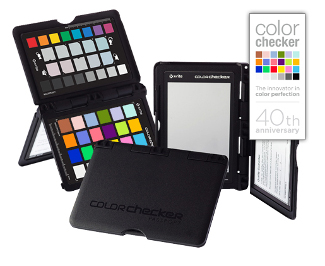
ColorChecker Passport
Color balance is critical for copying artwork. It can be a very painful process to try to match the color of the original work.
You can encode the color response of your copying camera and your RAW processing by photographing the X-rite ColorChecker on your copystand, then by building a custom profile with the X-rite ColorChecker Passport software. It provides whites and neutral grays to white balance on and a custom camera calibration to use on your copy files as a starting point in Lightroom or Camera RAW.
Equalight
Getting even lighting on the subject is almost impossible. While it is very important to try for an even distribution of coverage with your lights set at 45 degree angles, there is a unique and powerful digital technique/aid available to even out slight or even major variation in coverage. it is called Equalight.
The process involves taking a picture of the blank lighting itself and using it as a map of the lighting variations that is then subtracted from the copied image. Although it is possible to do this by hand in Photoshop with layers, the Equalight software makes the process much easier and systematic.

Watercolor. Ralph Putzker. Betterlight Scanning Camera copy by Stephen Johnson.
Here are a few ideas from my friend Robin Myers, creator of EquaLight that will help you.
1. If you are setting your exposure to a white patch on a ColorChecker, or some other target, make sure the white patch is at the brightest spot in the image area. This is VERY important or you may get burned out highlights!
2. I recommend dusting the white image before using it in EquaLight. This means removing dark dust AND white specular reflections.
3. I also recommend using a Gaussian blur on the white image before use. The radius depends on the size of the original, for my 100 MB images I use a 20 pixel radius (your mileage may vary). Smaller images may require a lower radius value. Often this blurring step will remove tiny dust spots, large ones should be removed as previously noted.
TUTORIAL
Field Workshop Introduction
Transcript of Field Workshop Introduction Video:
Photographically, the big scenes are seductive because they sort of sum up the place. They’re also probably the quickest path toward making a boring photograph.
That doesn't mean that you don’t take the big scenes, because we all like remembering where we were. We all like the postcards, the “we were there” pictures, those sorts of things.
But if you start to look at some of the smaller scenes, whether it’s the surf on the rocks and all of the plant life that is surviving in the tidal zone, the fallen trees making a kind of sculpture over the rocks, or whether it is the form of the rock itself, any clues that you decide to give as to location and scale are discretionary. You don’t have to tell a story that places any of this in space or time, that is up to you.
What I would really encourage you to do is to make the visual design of whatever you are looking at be the overriding consideration in terms of what you make a photograph of. But even then there is another issue out here. Because we may be looking at some rocks and say “wow that’s a really neat pattern,” But half of the pattern is formed in our mind from what we can barely perceive as there.
It is not an overtly visual thing; it’s as much an intellectual perception of a fracture as it is a visual manifestation of that fracture. Out here, the shade is as important as the rock. The shapes that the shadows make are as important as the shapes the rocks themselves make, or perhaps even more so to say, that sunlight and shade really do define the nature of the photograph.
After all, we are not getting the rock on the sensor, we are getting light and dark. We are writing with light, and you have to keep that in mind. Distance doesn't matter to the camera except where it’s going to be sharp or not, what matters is your sense of what you can see in a 2 dimensional representation of the light. And that may mean something small, something large, but overriding that you have to decide that the balance of the light and dark in the frame is giving you the design and the kind of emotional response to the landscape that you have in mind.
Steve leading a Field Trip with Maine Media Workshop: "Vision and Craft: Perfecting the Photographic Image."
Video by Reid Elem
Often times you've got to almost strip away your intellect from imposing words, descriptions and conclusions, and try to suspend that logical and rational input, and just look.
When you can, close an eye because that will remove your stereo vision and depth perception that you may have been relying on to think there is a photograph, as it disappears the photograph can also disappear. Sometimes it can also help to just squint your eye a little bit, that throws your image out of focus for your eye and you are able to see the patterns of light and dark easier.
TUTORIAL
Perspective Correction
As I was first learning to use a 4x5 view camera, one of the most amazing features was the rising front (lens) that allowed me to see a higher view by raising the lens relative to the film, without tilting the camera up. This ability to create precise geometric perspectives and keep vertical lines straight rather than converging was one of the fundamental interpretive tools I missed with my medium format and 35mm cameras.
Converging verticals are an interesting phenomena. We see them, they are real, but except where the convergence is extreme, such as at the base of a tall building, we tend to subtract them out of our visual take on a scene. Perhaps we don't notice them as much as our eyes create circular non-edged visions, without the straight lines of our photographic rectangles.
In the darkroom, we would occasionally tilt the paper easel and lens to correct for convergence and distortion, but the correction that could be done was very limited with a desire to maintain focus as well.
But now we have Photoshop. As much as I rail against overt intent to deceive or soup-up reality in images presented as photographs, I have generally seen perspective correction as one of the wonders of this new medium and creating the same effect I might seek with a view camera.
Of course there are now shift-tilt lenses available for 35 and medium format cameras, but they tend to be expensive and limited in their ability to do what I would have done with my view camera.
To correct for convergence, I tend to use the Transform/Distort command in Photoshop (with Grids turned on) which gives me individual controls of every corner. I work at pulling edges in rather than pulling them out, to straighten lines, throwing away data rather than making up more new intermediate pixels to render the now aligned lines.
This is an important capability, perhaps not quite as fundamental as minimizing chromatic aberration which is a natural consequence of trying to focus three different wavelengths of light on the same imaging plane. But I've always believed that it is a wonderful step forward where digital photographic techniques can eliminate common photographic problems that are not part of our normal human visual perception. Perspective correction rests somewhere in a middle ground between what we see, don't notice, but is then emphasized by the photographic process. I think we are well served by the ability to dial it back.


TUTORIAL
Check Exposure and Composition
A Video Transcript
It’s ironic that one of the real advantages of digital photography, the ability to see the images at the time you make the photograph, is also now being subjected to some derision by people suggesting that if you take the time to look at your photographs after you make them, you are somehow not taking advantage of the flow of time and you might miss some images.
Well I would contend that one of the real advantages of being able to fine tune the exposure into the kind of photograph that you want, is the ability to look at the photograph after you have made it. The idea being to take that guess that the light meter made, see how that actually recorded on the sensor by inspecting the histogram, and then modifying subsequent exposures if you need to, so that you really do take as full advantage of the sensor, the tonal range definitions of the image, and be able to move the image into the best possible quality that you can.
You've got to remember that the light meter was always a guess of the exposure and we did our best to cope with the fact that it was a guess by having an 18 percent gray card to allow the light meter to see what it was expecting to see. Nowadays we still have to guess with the light meter as a starting point, but have the histogram as a measure of the exposure, therefore giving us a chance to see how the photograph actually recorded, rather than just a guess at the kind of light that is needed in order to stimulate the silicon sensor.
That kind of advantage alone would be reason enough to inspect the photograph after you make the exposure. But when you add to that the fact that we now have fairly high quality previews of the image that come with that histogram, naturally that is after all why that thumbnail gets put up there to begin with, we also have a chance to look at the photograph and try and understand what it is we have just done. So that we can look at nuances of composition, exposure, maybe areas that weren't quite as sharp from the depth of field choices that we made, that the thumbnail coupled with the fact that you can zoom in on it, scroll around on it and get an idea of what the image actually contains, start to move away from this metaphor of snapping, snapping, snapping, making a lot of photographs, and starts to encourage the opportunity to slow way down. Consider each photograph as a unique expression of your creative impulse or your reaction to the scene, and take that particular photograph that you’re making, even if it’s not that particular exposure, but that particular photograph seriously is a finished work of art.
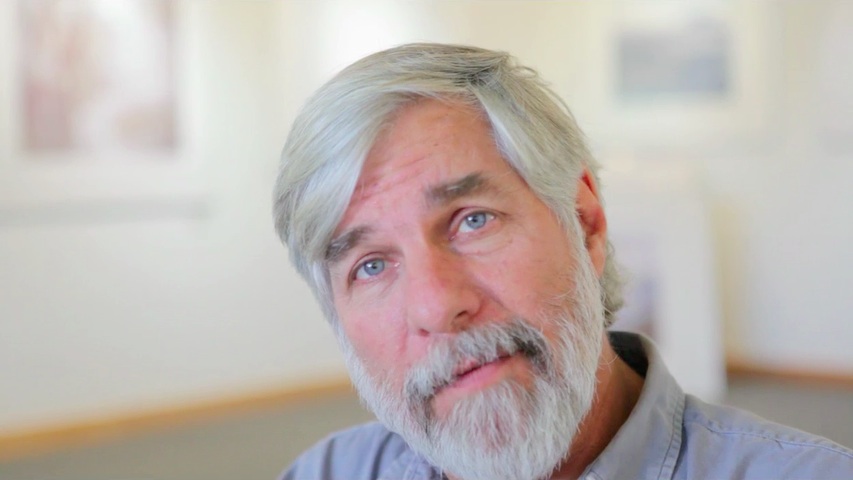
Click image to go video clip.
And that doesn't come from a lot of rapid shooting except under those rare circumstances where that evolution of motion is critical. From my standpoint, especially as a landscape photographer, that careful seeing comes from slowing way down, looking carefully, considering exposure, considering the composition, considering the depth of field. The ability to look at the photograph after you have made it, to try and make a subsequent attempt at making it the best it can be, is one of the processes that I relish and cherish in this whole new digital photography workflow. Now we can look at the back of the camera and understand what we have done, learn from what we have just done to try and make the next attempt at making the next photograph the best it can be.
It’s a workflow that is not about a continuous stream of images, but taking seriously the photograph you are making at that moment as an individual expression, then working it through to completion just like you would if you were under a dark cloth on a 4x5 100 years ago, 20 years ago or even today still using a 4x5 view camera with all of the slow methodical care that that implies.
| | | | 


